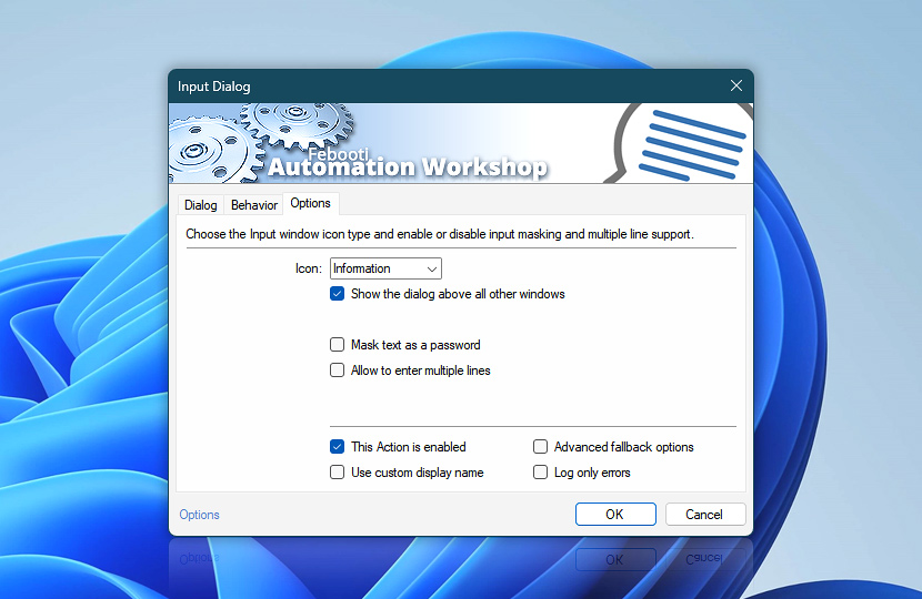
Select the message window icon from the list of available types such as Information, Warning, Error, Question or none. The Input Dialog icon can increase the visibility of the input dialog window and intuitively convey the type of the interaction.
The Show the dialog above all other windows option increases input window visibility even more by placing the input dialog on top of all other windows, directly in front of the user.
The Mask text as a password option helps to enter necessary data secretly when other people are watching. The input field itself can be extended by enabling the Allow entering multiple lines option.
| Options | Details |
|---|---|
| Icon | Choose the input dialog window icon from the following options.
|
| Show the dialog above all other windows | Places Input Dialog window on top of all other windows for better visibility. |
| Mask text as a password | Display placeholders instead of actual characters when entering a value in the Input Dialog window. Useful for entering sensitive information while other people are looking. |
| Allow entering multiple lines | Extends the input field so that it supports multiple lines instead of one. |
| This Action is enabled | An Action is executed only if it is enabled. Otherwise, it will be automatically skipped (completely ignored) from the Task flow. |
| Use custom display name | Rename this Action, to make a human-readable workflow that will help you to find, read, and make sense of the Task structure later. |
| Advanced fallback options | Manage the advanced fallback options—select which error types will lead to automatic execution of predefined workaround operations. |
| Log only errors | Do not log information and warning messages for this Action. It may be useful to keep the log file small and tidy on production systems. |
We are here to help…
If you have any questions, please do not hesitate to contact our support team.

